
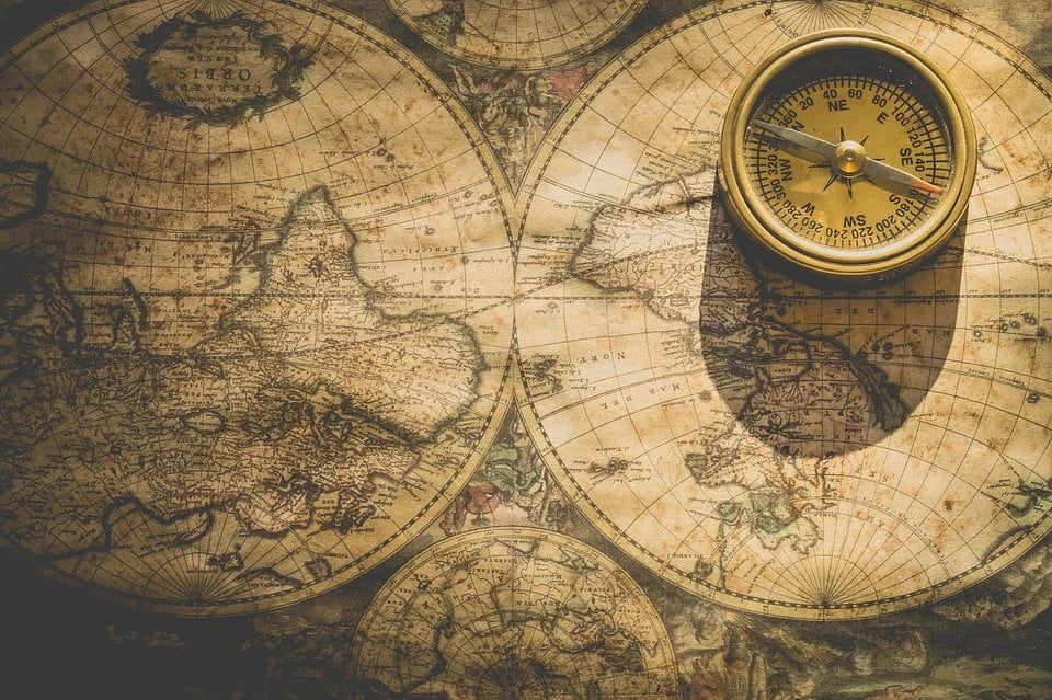
Before we get to the question of what types of maps there are, we should first answer a more basic question:
What is a map?
Every one of us has come across a map at least once in their life. If you drive, you have certainly used a map, whether an electronic one or a more traditional paper one. If you play video games, you have probably met a map in more than one of them.
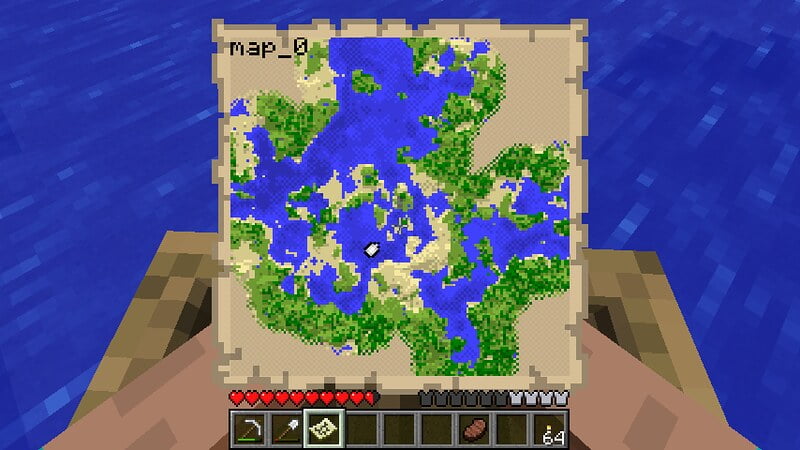
You can see a map in a shopping centre, and sometimes even on road signs. Maps are everywhere and have accompanied us in many everyday activities since the dawn of time.
The most popular type of map is one that shows some area of the Earth’s surface, although there are also maps of the sky and of other celestial bodies.
Let’s come back down to Earth, though. Since our planet is roughly the shape of a ball (more precisely, an ellipsoid flattened at the poles, and more precisely still, a geoid), showing its features on a flat surface, such as a sheet of paper or a computer screen, comes with certain difficulties. Such a representation will never be 100% accurate.
It is easy to picture this by trying, for example, to wrap an apple in a sheet of paper. The paper will never lie smoothly and snugly against the round surface of the apple. Creases and bumps will form, and in some places the paper may even tear.
Different map projections solve this problem in different ways. Each of these solutions has its pros and cons.
Another feature of every map is its map scale, most often shown as a representative fraction. It is the ratio of a distance on the map to the corresponding distance on the ground.
To put it as simply as possible: if things on the map are 100 times smaller than in the object being shown, we are dealing with a map at a scale of 1:100. As you can easily work out, on such a map every stretch that is a kilometre long in reality is shown as a 10-metre stretch, because 1000 metres divided by 100 (the scale) = 10 metres.
Another way of working out real distances from a map at any scale is to replace the “1” with one centimetre, for example 1:100 000, which gives 1 cm : 100 000 cm, and that in turn means that every centimetre on the map is 1 km on the ground.
Looking at almost any map, ideally a paper one, we can see various symbols, signs and colours drawn on it. Each symbol or colour can mean something different depending on the map, although there are a few universal symbols, known as cartographic signs.
For example, a spot height is a symbol (a point on the map) that appears on a great many maps. It usually takes the form of a large dot and marks the location of peaks, passes, cliff edges, the lowest point of a depression or the place where two rivers meet.
A spot height is also often used as an elevation marker on the map. If a lot of symbols are drawn on a map, it is easy to get lost in it. That is why clever people came up with something called the map legend. A map legend, however, has nothing to do with tales of dragons and princesses.
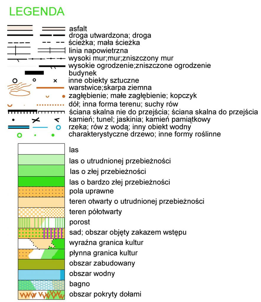
The map legend describes and explains all the more important symbols on the map. Almost every map has some kind of legend - bigger or smaller, more or less detailed.
The last important feature of a map is its level of detail. Every map contains some simplifications and generalisations. That is logical, because you cannot show absolutely everything, a whole city for instance, with perfect accuracy, especially on small-scale maps below 1:500 000.
That is why cartographers (cartography is the science of maps, and a cartographer is someone who works in this field professionally), when making a map, use the symbols mentioned earlier and plenty of generalisations and simplifications, so as to strike a sensible compromise between accuracy on the one hand and the readability and usefulness of the map on the other.
Let’s sum up the facts so far
What is a map? It is a graphic representation of some surface or arrangement, drawn to an appropriate scale and using a chosen map projection. Maps also contain many map symbols and cartographic signs, which are partly explained by the map legend and partly follow accepted conventions.
To make a map (in the case we are looking at, this means showing a sphere on a flat surface), you need:
- a map projection, in other words a suitable way of projecting the globe onto a plane.
- an appropriate map scale, kept throughout
- symbols described in the map legend
- a chosen degree of simplification
Map elements: what is (almost) every map made of?
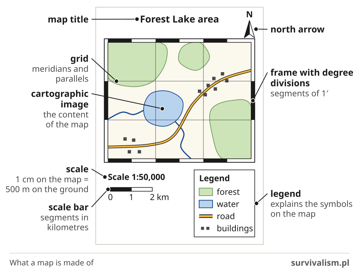
This one is fairly simple. A map consists of three basic elements:
- the cartographic image, i.e. the content of the map, which makes up its main part,
- the mathematical elements (scale, grid, scale bar, frame with degree divisions),
- the legend.
Map scale
I have already said a bit about map scale earlier, so you now know how to work out the scale of a map. You will find more on calculating map scale at this link (in Polish).
Scale is a very important feature of a map, which is why one of the key map classifications is classification by scale.
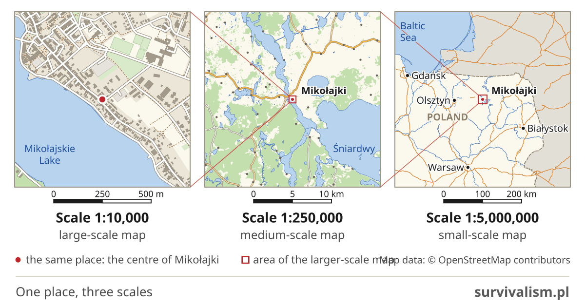
There are 3 basic ranges here. Polish school geography materials divide them like this1:
- large-scale maps: a scale larger than 1:200 000 (town plans, topographic maps),
- medium-scale maps: from 1:200 000 to 1:1 000 000 (e.g. road maps),
- small-scale maps: a scale smaller than 1:1 000 000 (overview maps, e.g. a map of a whole country or of the world).
These boundaries are not fixed once and for all, though. Encyclopaedias sometimes put them much lower: large-scale maps end at 1:10 000, and small-scale maps start below 1:500 0002. If you are studying for a test, stick to the division in your own textbook.
The general rule is that the larger the scale of a map, the more detail it contains. It is not an absolute rule, though - there are also big small-scale maps, “wall-sized” ones, that do not contain much detail and show only a rough outline of the terrain.
Classifying maps by content
Different types of maps can fall into different groups and categories, depending on how they are classified. One of the most important ways of classifying maps is classification by content:
- general geographic maps
- topographic
- topographic overview
- overview
- thematic maps
- socio-economic
- natural and physical geographic
- political and administrative
The most important types of maps
There really are a lot of types of maps, but in the vast majority of cases, in everyday life, we come across three of them.
Political map
The main purpose of a political map is to show the areas of countries, cities and other administrative units, as well as the course of borders and the location of dependent territories - if there are any.
Political maps usually leave out landforms such as hills and depressions. Railways, roads and settlements are generally left out too, although the capitals and largest cities of a given country or territory are almost always marked on a political map.
Geographic map (general geographic map), sometimes also called a physical map
A general geographic map contains most of the main features of the Earth’s surface and its relief. These include, for example, rivers and lakes, built-up areas and forests, but also mountains and hills, depressions, canyons and other landforms.
This type of map is the most widespread and the most versatile. It gives an overview of the most important features of a given area. General geographic maps keep the same relative level of detail throughout. The scale of general geographic maps varies a lot: from topographic maps (1:10 000-1:200 000) to overview maps (at scales smaller than 1:200 000). One of the most important types of general geographic map is the topographic map.
Topographic map
A topographic map is a map that shows the topography of the land, that is, its relief, of which the most important element is height above sea level, known as absolute elevation. Absolute elevation is marked with the abbreviation a.s.l., meaning “above sea level” (in Polish: n.p.m.). Elevation on topographic maps is shown with isolines (isohypses), in other words contour lines, for which Polish has two names, one used in surveying and the other in cartography. These are lines on the map that join points at the same height above sea level.
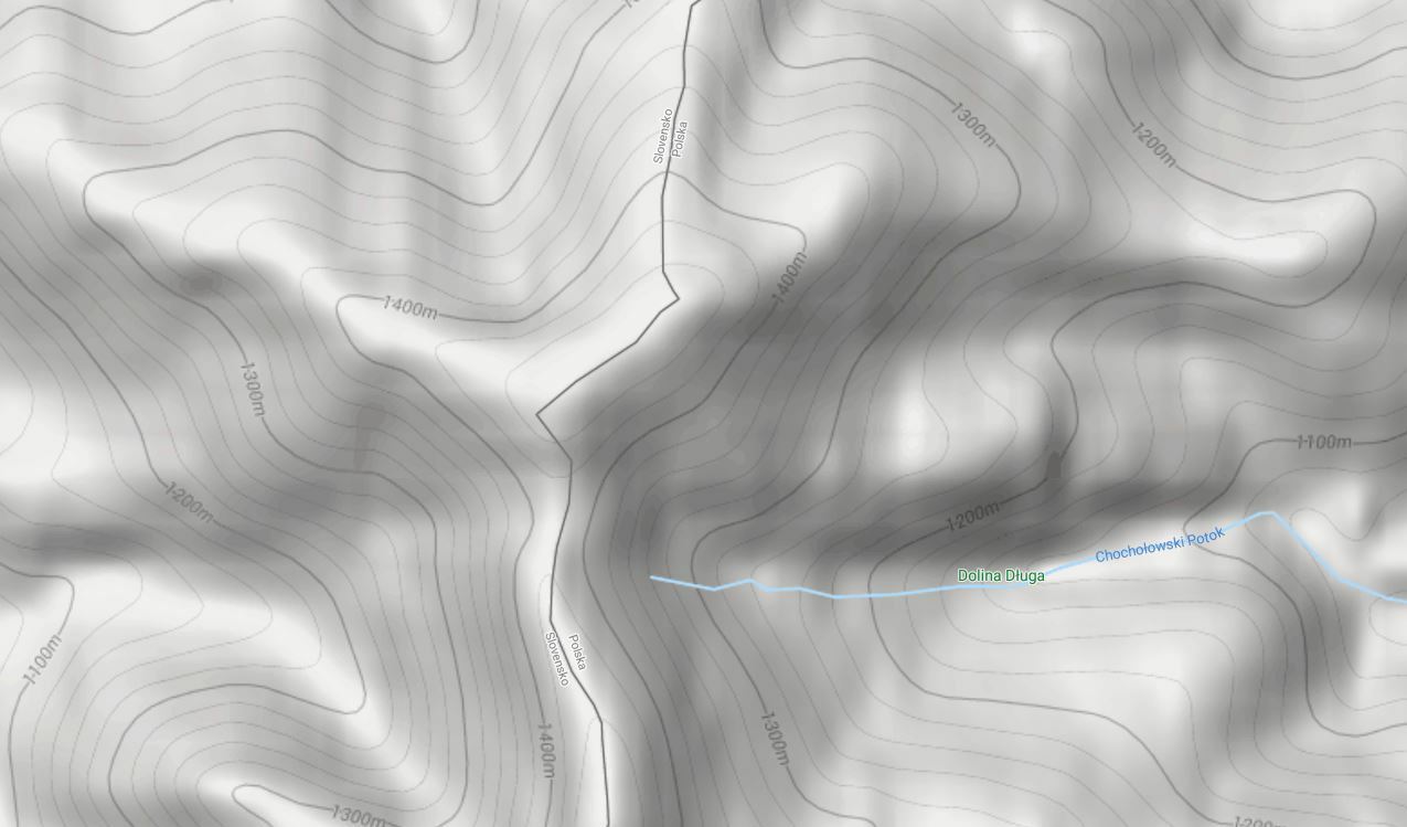
Because of the relatively large amount of detail, a topographic map can look quite hard to read and interpret at first glance, especially if the terrain it shows varies a lot in relief and height.
To find your way around it easily, just remember one general rule: the closer together the contour lines, the steeper the slope. And the other way round: the further apart the contour lines, the gentler the slope of the hill.
A topographic map usually shows not only natural landforms but also all the important man-made features. These include, for example, buildings and other structures, drainage channels, artificial reservoirs, roads, railway lines, town names and any other important and distinctive landmarks.
Less common types of maps
Besides the most popular and most important types of maps listed above, in various fields we can often come across other, less popular types of maps.
They can be classified according to all kinds of criteria and systems, which differ not only in purpose and in how they show the terrain, but even depend on the country where the maps were made.
Below are the most important of the remaining types of maps, each with a short description.
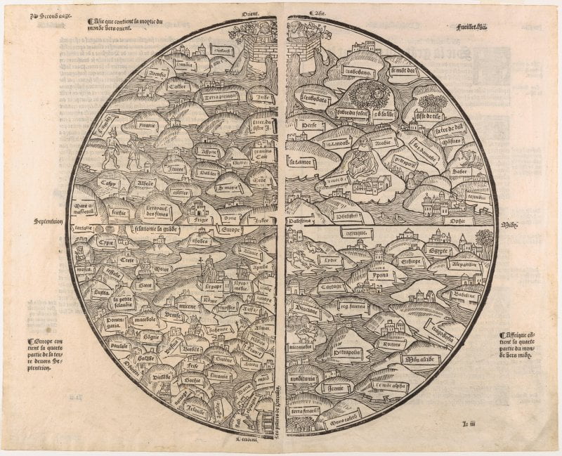
T-O map
One of the most classic maps, with roots going back to the early Middle Ages. It is the simplest form of the mappa mundi, which I write about at the end of this list. It shows the whole world known at the time, surrounded on all sides by the waters of the oceans.
Noise map
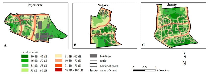
A noise map shows a chosen area, usually a city, in order to identify quiet areas and areas with increased noise from road traffic, railways and industry. In Poland, cities with more than 100,000 inhabitants have to produce such maps every 5 years - you will usually find them on your city council’s website. Such maps can be used when valuing property. In areas with higher noise levels, near railway lines for example, property prices may be lower than in quiet areas.
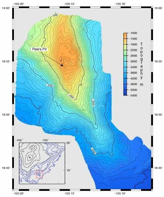
Bathymetric map
This is a map whose purpose is to show the depth and shape of the bottom of bodies of water, oceans included.
Road map
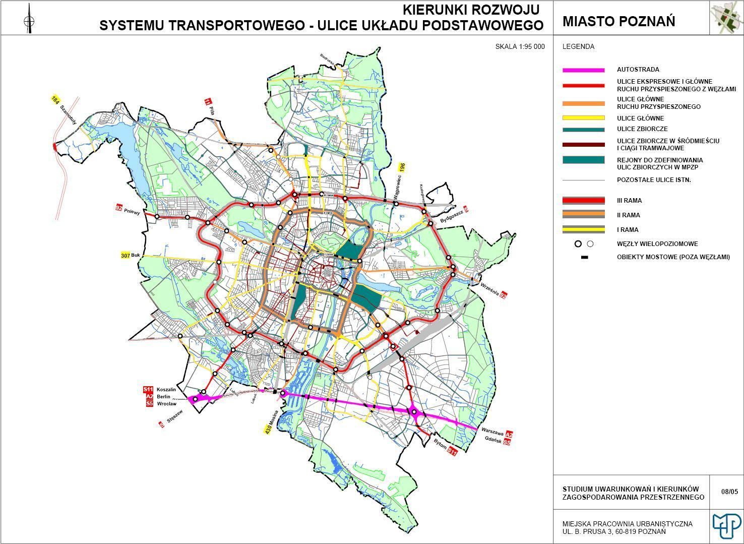
This is a map that focuses mainly on showing the network of roads for motor traffic in a chosen area, together with their local and international numbers.
Road maps also often show distances between towns and things that matter to someone travelling, a tourist for example.
These may be motels, hostels and hotels, tourist attractions, car parks, petrol stations and so on. At the same time, features such as the shape of the land are left out, and some topographic features, such as rivers or forests, are shown in a simplified, schematic way.
Geological map
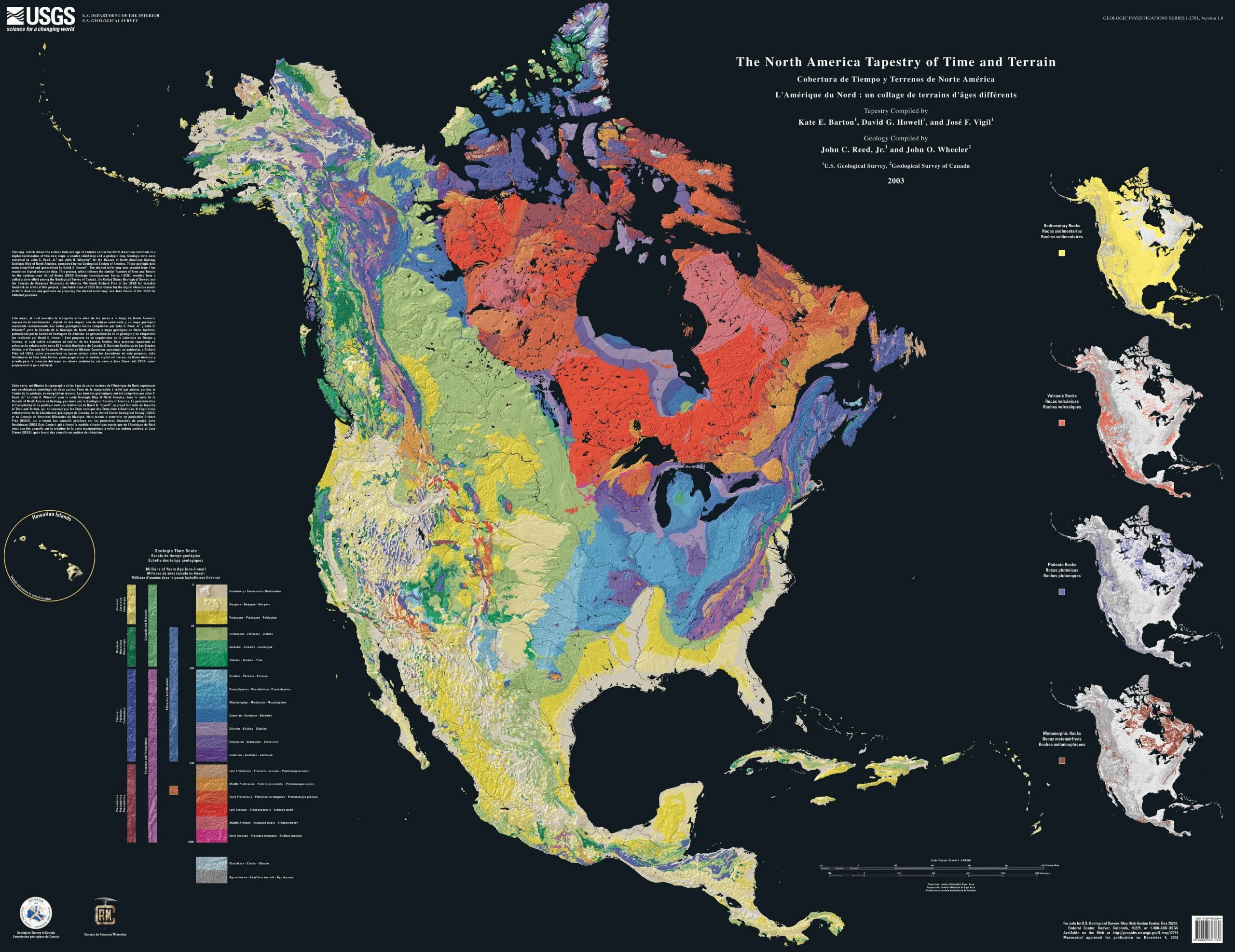
A geological map, as the name suggests, shows geological content, usually in a heavily simplified form. Most often this is the age of the rocks, less often their type. Individual rocks are marked with contrasting colours according to an accepted convention.
Forest district management map
This is a 1:5000 scale map, made and used for forest management in a forest district (the local unit of Poland’s State Forests). With it you can determine the area and condition of the forest, its boundaries, markers, compartment numbers, roads and so on.
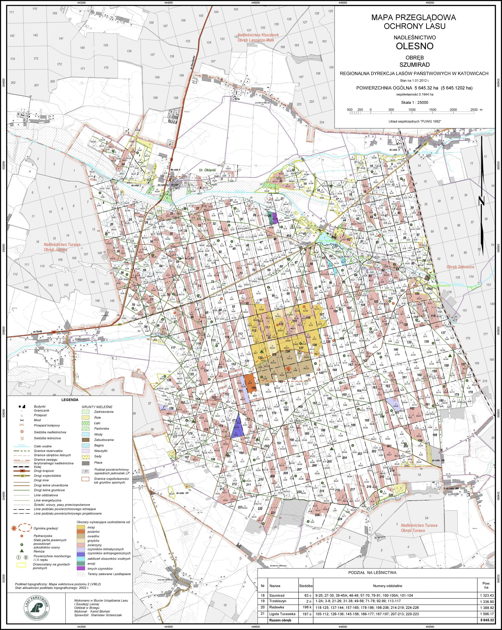
Forest overview map
This map, at a scale of 1:25 000, is based on the topographic map and the management map. It is used as the basis for other important forest management maps:
- tree stand overview maps,
- overview maps of felling and unforested areas,
- habitat overview maps,
- forest protection maps,
- fire protection maps,
- tourist development maps,
- project maps for road networks, land drainage, stream regulation and general construction.
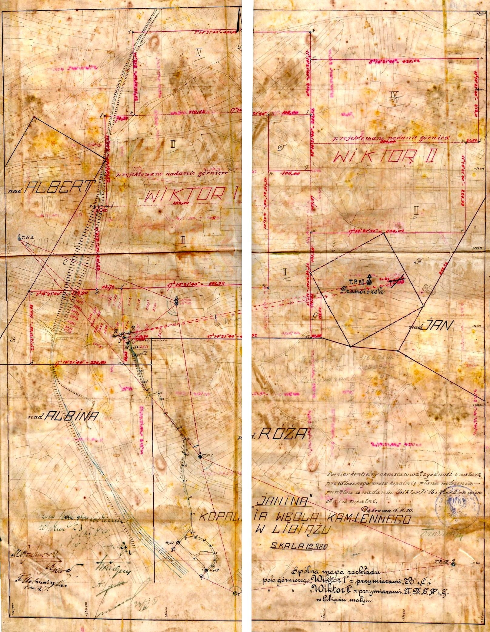
Mining map
A mining map shows matters related to extracting raw materials: the area of the deposit, the workings and the geology of the deposits.
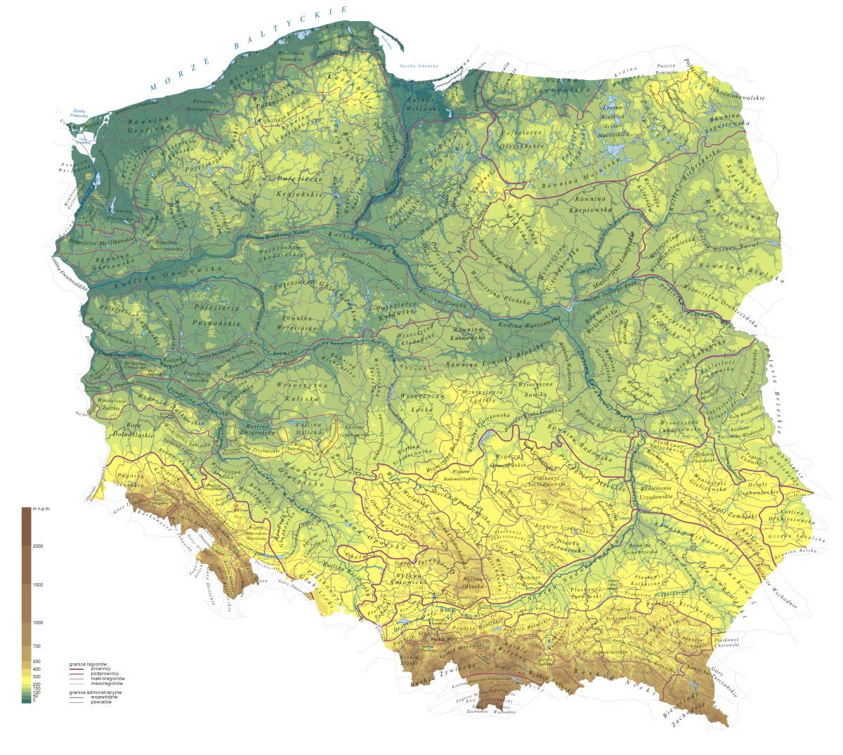
Hypsometric map
This is one of the maps in the category of general geographic maps, on which the shape of the land is shown with contour lines and colours. On a hypsometric map you can easily pick out all kinds of raised landforms, such as mountains and uplands, lowland areas and hollows in the terrain, including valleys and basins. The hypsometric map is considered the most suitable for learning geography.
Postcode map
A postcode map shows how a country or another region (Poland, for example) is divided into areas or places with the same postcode.
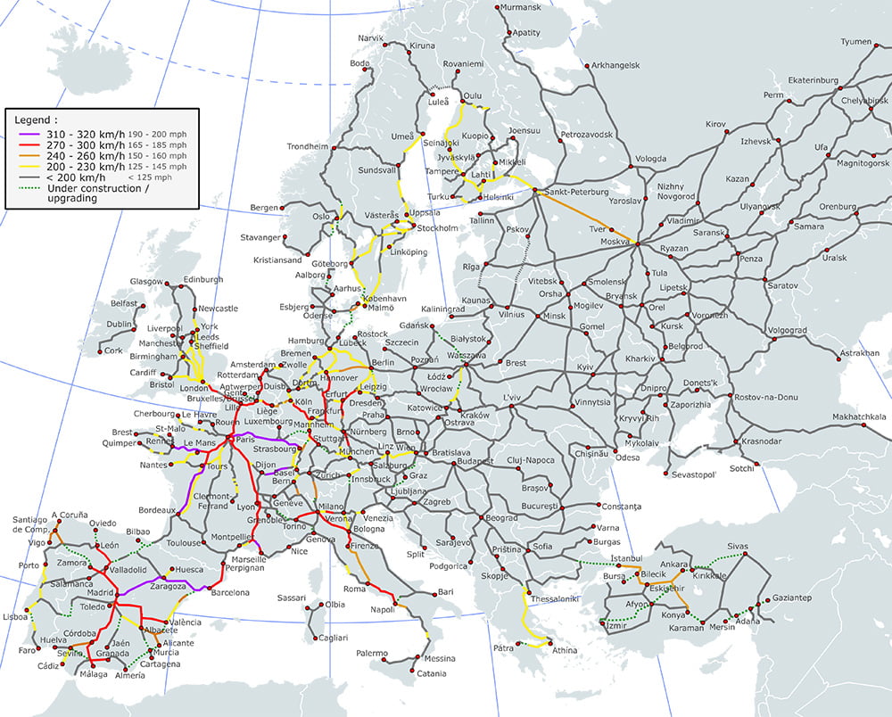
Railway map
A map showing railway infrastructure with its parameters marked, such as maximum speed, electrification, track gauge, number of tracks and the category of the railway line. It can also show infrastructure such as level crossings, tunnels and so on. Some railway maps also show historic and planned lines.
Hachure map
Hachuring (also known as hatching) used to be a way of marking mountain slopes on maps, but it is no longer used for this purpose today. By varying the direction of the hachures and the thickness and pattern of the lines, you can get a range of graphic effects.
This approach makes it possible to cut the cost of producing a map, because there is no need to print it in several colours. Colours on a hachure map can be replaced with a suitably arranged pattern of lines. With skilful hatching you can even show three-dimensional objects.
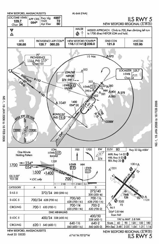
Aeronautical chart
An aeronautical chart is used to navigate aeroplanes and other “aircraft” correctly (that is the technical name for anything that flies: aeroplanes, helicopters, gliders or balloons). A pilot’s good command of map reading is one of the basic conditions of a safe flight.
Most aeronautical charts (including ICAO standard charts at 1:500 000) are drawn in the Lambert conformal conic projection. As in the Mercator projection, angles are preserved, which makes it possible to navigate by compass, and on top of that a straight line on such a chart is close to the shortest route between two points.
Nautical chart
A nautical chart is used mainly for safe navigation at sea. It is a graphic picture of the sea surface, with the coastline, sea currents and tides, the depth and shape of the seabed, seaports and bridges.
Just as with an aeronautical chart, the ability to use the chart without mistakes is a condition of safe and reliable navigation. As on most navigational charts, the Mercator projection is used here.
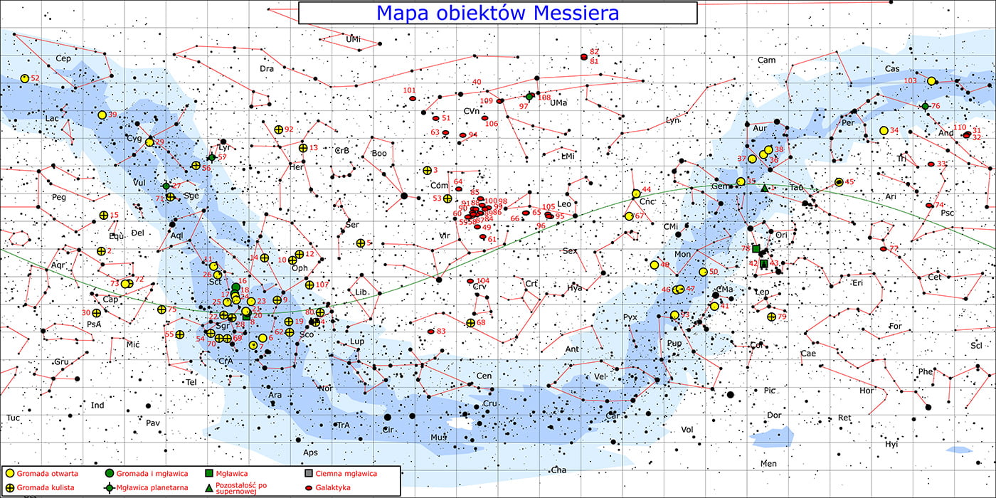
Star map
This map is a picture of the starry sky on a flat surface. It is one of the oldest types of map - already in ancient times, Ptolemy’s star catalogue covered more than a thousand stars in 48 constellations.
Stars on a star map are shown with symbols that depend on how bright they are. The coordinate grid drawn on this map is used to determine the astronomical coordinates of celestial bodies, that is, their declination and right ascension.
For technical reasons, the scale on a star map is given in angular measure.
Digital map
The digital map, that is, a map in electronic form, has revolutionised cartography and related fields. Google Maps is one example of a digital map. Digital maps have many clear advantages over analogue ones.
They can be updated continuously. They also have a variable scale, so that - depending on your needs - you can zoom in or out on the area you are looking at, increasing or reducing the level of detail. Thanks to progress and the miniaturisation of electronics, very large collections of maps can be stored on relatively small storage media.
The downside of digital maps is that you need a suitable device, powered by electricity, to read them, whereas a paper map needs no extra equipment at all.
Digital maps in vector form do not lose quality when the scale changes (raster maps, such as scanned paper maps or orthophotomaps, become blurry when zoomed in a lot).
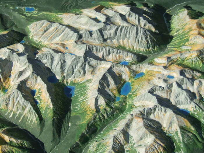
Raised-relief map
A raised-relief map is a three-dimensional representation of an area, usually a mountainous one. Maps like this were already being made several hundred years ago, and they were usually carved.
Once painted, such a carved relief map often became a work of art.
Today raised-relief maps are often made by casting, on CNC milling machines and, more recently, with 3D printers.
Unlike two-dimensional maps, a raised-relief map has two scales: a horizontal one and a vertical one.
Weather map
A weather map, also known as a synoptic chart, shows the current state of the weather over a chosen area. The data for drawing and updating a weather map comes from synoptic weather stations. Synoptic charts make it possible to forecast the weather (with a certain probability).
Overview map
An overview map usually shows large areas, often whole countries or even continents. It is drawn at a scale smaller than 1:200 000, so it is usually a medium- or small-scale map.
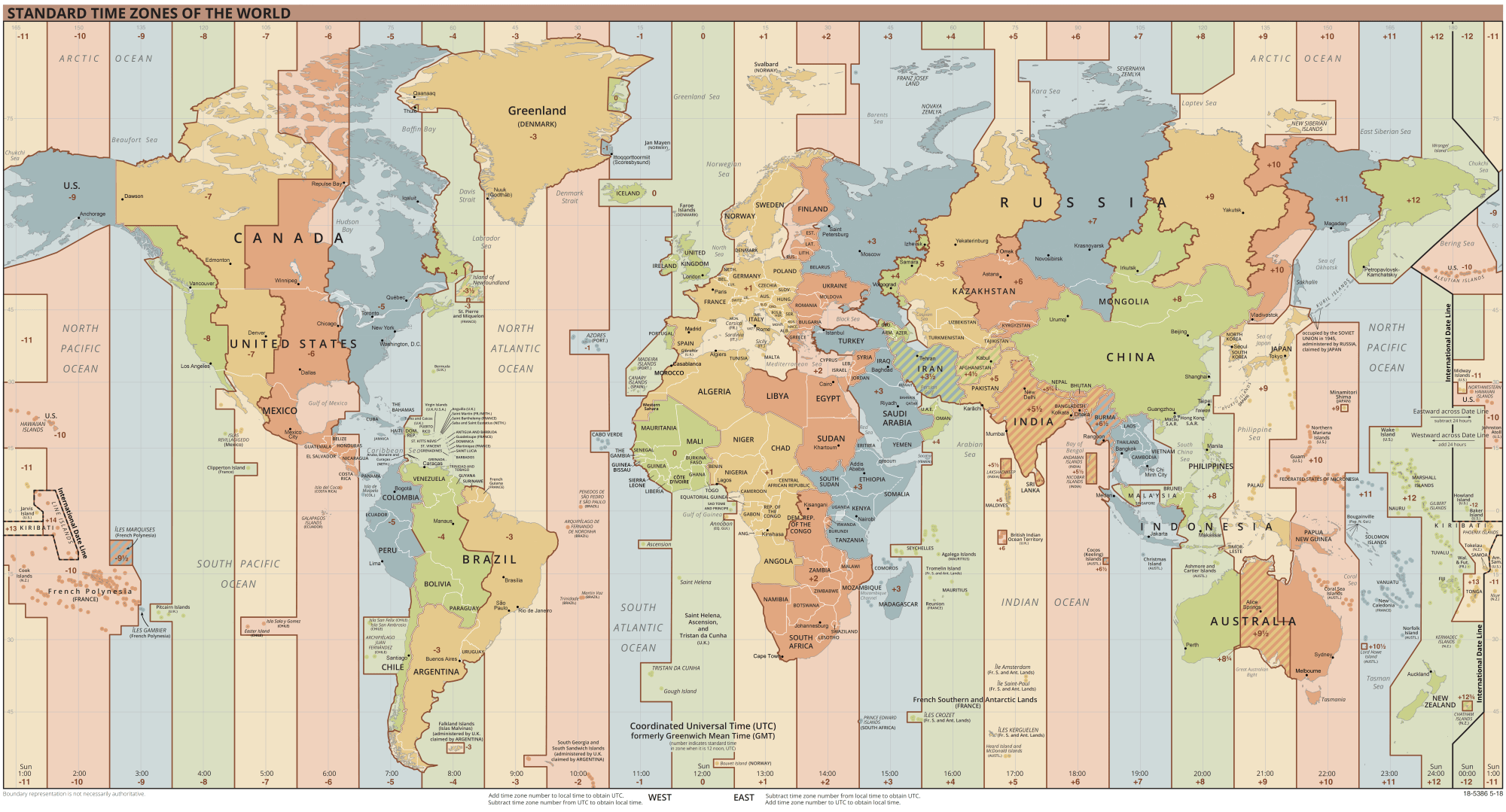
Time zone map
A time zone map shows - as its name says - how the world is divided into time zones.
Earthquake map
An earthquake map shows data collected from seismic stations, divided into earthquakes caused by volcanic activity and those caused by movements of tectonic plates.
Tourist map
Tourist maps are made with leisure in mind. They contain a lot of information that matters for typical tourist activities. They also contain general geographic and topographic information. They show distinctive landmarks and topographic points, as well as places worth visiting for sightseeing and fun.
Key elements of every tourist map are marked trails, places to stay and estimated walking times between individual attractions.
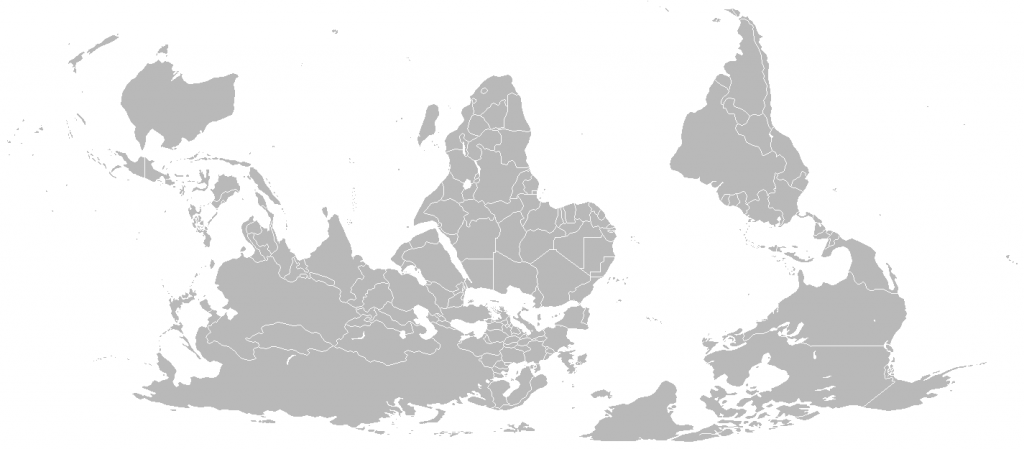
South-up map
A peculiar type of map is the south-up map. Its main feature is that the top and bottom are flipped, so the South Pole is at the top and the North Pole at the bottom.
Historically, south-up maps were used fairly often (Arabic maps, for example), and in medieval Europe maps were usually drawn with east at the top. The astronomer Ptolemy (2nd century AD) did put north at the top, but north-up only became the universally accepted convention in the 15th-16th centuries, when his “Geography” was rediscovered and sailors were already using the compass.
If you would like to learn more about geographical directions and how to find north in the field, have a look at the article on the subject: geographical directions.
Multi-scale map
It usually shows a small area at several different scales, so you can look at the terrain with varying degrees of accuracy and detail. Most digital maps are multi-scale maps that let you change the scale smoothly by zooming in and out.
Base map
The base map (mapa zasadnicza in Polish), also called the basic map of the country, is a large-scale (1:500-1:5000) surveying and cartographic product covering the entire territory of Poland. Since 31 July 2021 it has been kept in digital form only.
This map is the reference model for other maps. It is used for land registry, economic, planning and strategic purposes. Other cartographic products for commercial uses, such as design or construction work, are made on the basis of the base map.
Mappa mundi
Mappa mundi literally means “cloth of the world”, since the Latin word mappa meant a cloth or napkin. It is one of the earliest maps, made in the early Middle Ages, showing the whole outline of the world as it was known then, surrounded by the waters of the sea.
A mappa mundi was usually oriented with east at the top, and in many maps from the 12th-14th centuries Jerusalem was at its centre. The picture and the shapes on this map were heavily distorted.
Which map should you take into the field?
You now know what types of maps there are. On a trail, in the woods or in the mountains, though, you will mostly need a tourist map, a topographic map and their digital versions on your phone. The first thing to look at when choosing one is the scale.
For hiking in the mountains, and anywhere every path matters, the best scale is 1:25 000. Every centimetre on the map is 250 metres on the ground. For longer walks and for cycling, 1:50 000 is enough, which means 500 metres per centimetre: you see less detail, but a whole region fits on one sheet. Both scales fall within the range of topographic maps I wrote about above. In practice, most Polish tourist maps, for example those of the Beskids, are published at 1:50 000, while the more detailed ones, such as maps of the Tatras, come at 1:25 000-1:30 000. Cycling maps are sometimes even less detailed (1:75 000 or even 1:100 000).
On a map with contour lines, first check the legend for the contour interval, that is, how many metres of height lie between one line and the next. It varies from map to map. Then remember the rule from the section on topographic maps: the closer together the contour lines, the steeper the slope. Where the contour lines bend with the bulge pointing down the slope, you are looking at a ridge, and where the bulge points uphill, it is a valley, usually with water flowing down it.
A map on your phone is convenient, but it depends on the battery. GPS works even without a mobile signal, as long as you have downloaded the map to your phone’s memory beforehand (offline mode). In the cold, however, the battery drains faster, so keep your phone in an inside pocket, close to your body, and take a power bank. Rain, wet gloves and numb fingers do not make a touchscreen any easier to use either. That is why on a longer trip you should take a paper map and a compass as a backup. They need no power and will not die on you at the worst possible moment. That is, as long as you know how to use them, so practise calmly before you need to.
A paper map has an enemy of its own too: water. A soaked map quickly becomes unreadable and tears along the folds. Put it in a waterproof map case or an ordinary zip-lock bag. You can also buy a laminated or waterproof edition straight away, because some tourist maps are published in that form as well.
And one more thing: check the year of publication. Publishers print it on the cover or in the imprint. Trails get rerouted, new roads appear, and an old map can lead you down a path that no longer exists.
Final word
The types of maps described above are only some of those out there. My choice for this article was fairly subjective. The truth is that there are a great many types of maps. There is also a huge variety in how maps are classified and grouped.
I hope, though, that this article has shed at least a little light on the subject and that you now know a bit more about the different kinds and types of maps.
Sources
- Zintegrowana Platforma Edukacyjna (the Polish Ministry of Education’s learning portal), geography lesson on maps, aerial and satellite images and GPS (secondary school), in Polish: zpe.gov.pl
- Zintegrowana Platforma Edukacyjna, lesson material on finding information and measuring distances between points (division after the PWN encyclopaedia), in Polish: zpe.gov.pl
Leave a comment